and the distribution of digital products.
DM Television
Settling the Product Design vs. UX/UI Design Debate Once and For All
I often come across the fact that people mix up the concepts of product design and UX/UI design. This is done by employers, employees, and even authors of educational programs. Some People think that these are just different names for the same profession. There is also an opinion that a product designer is just a very good interface designer who does the same thing only better. I even know one good design school, where the main difference of a product designer is that they deal with mobile applications. In my presentation, I want to tell you what the role of a product designer is, and how it differs from the role of an interface designer. And how this manifests itself in practice.
\ In fact, everything is very simple. A product designer must, first of all, solve product problems. Shift the focus from the user and put the balance between the user, business and developers in the center. Of course, the more convenient the application is for clients, the better for the business. However, when designing, it is necessary to solve the main business problem and roughly understand the cost of developing and implementing a particular function. Thus, instead of the user standing in the center, a triangle arises: business - user - developer, working within which the product designer must find a fine balance and offer the optimal solution.
\ When drawing a new screen, a product designer thinks not only about how it will be convenient for the user, but also about how it will solve the business problem, and whether it is optimal from the point of view of the development department's resource costs. As a result, for the product to be successful, the designer needs to change his attitude to designing something like this
\
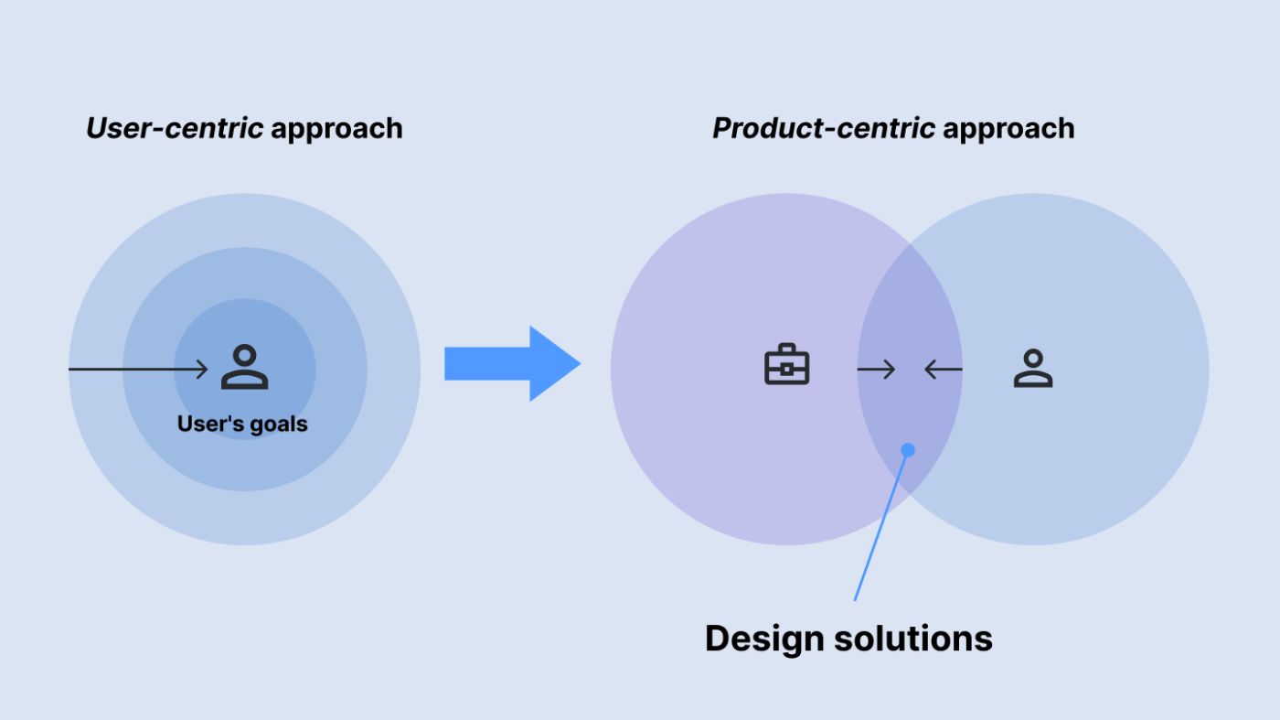
Why can't we just put the user in the center and simply design the most convenient application that will best solve their problems? The thing is that in reality there is a conflict of interests between the user and the application owner. Usually, this is the need to monetize the product or site so that the developer company and the development team have resources to develop and support this product. But other options are also possible that are not related to money. In addition to this conflict, when designing, you need to understand the cost of implementation. Not only to know the technical limitations, but also to understand in principle how the development works, and to create an interface so that as few developer resources as possible are spent on its implementation. Choose the methods that are the least expensive and difficult to implement.
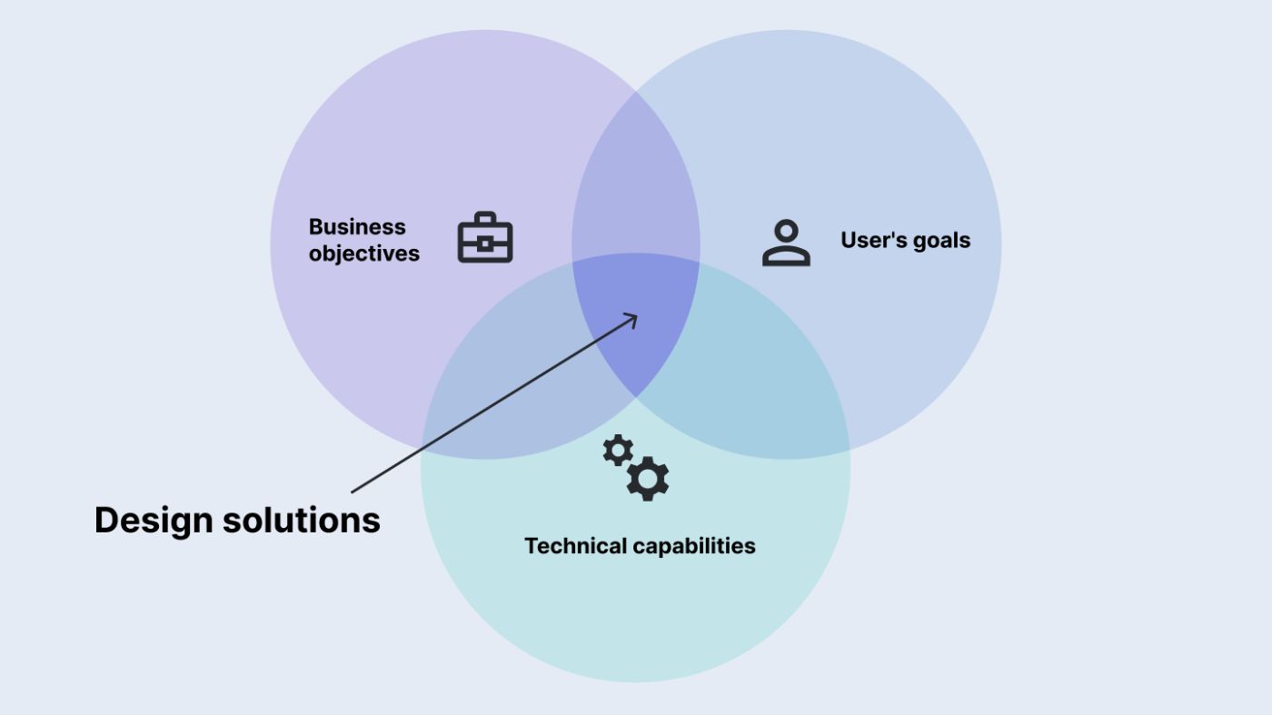
The first is to find out the business objectives of the product. This could be market capture, profit maximization, reduction of company costs, the need to shock the audience with a unique design, the fastest possible launch of the MVP, etc. You need to immerse yourself as deeply as possible in the context, for which you need to build communication with the product owner and product management. And when setting new tasks, immediately find out or choose a business goal.
\ Second - study the user. Study the needs of the audience, create scenarios, design user flows, etc. That is the essence of the work of an interface designer
\ Third - study the technical limitations. This can be done by creating good communication with the developers. It is necessary to involve them at the earliest stages of screen design and build a constant dialogue, making them full participants in the design process, giving them the right to vote. If you debug this communication process with the development department, over time the product designer himself will begin to understand the resource intensity of a particular function, and ways to optimize the interface that will save resources
\ And the last. The method by which we will look for this balance is an iterative approach with constant feedback collection and refinement of user scenarios based on the results. Only in this way can a product designer solve this problem and find the optimal solution.
\ It is this three-sided view that will allow you to see the whole picture, and constant testing and feedback collection will allow you to find a balance when making decisions in the interface design process. Both at the strategic level and in all the details, right down to the choice of button shape and icon size
An example from practice. How the product designer works.To help you understand what I'm talking about, I'd like to demonstrate this approach using a practical problem as an example. This is a real problem from the practice of one of my colleagues, but for the sake of simplicity of presentation I will try to simplify it as much as possible and discard some steps and details that are not essential for demonstrating the approach I described.
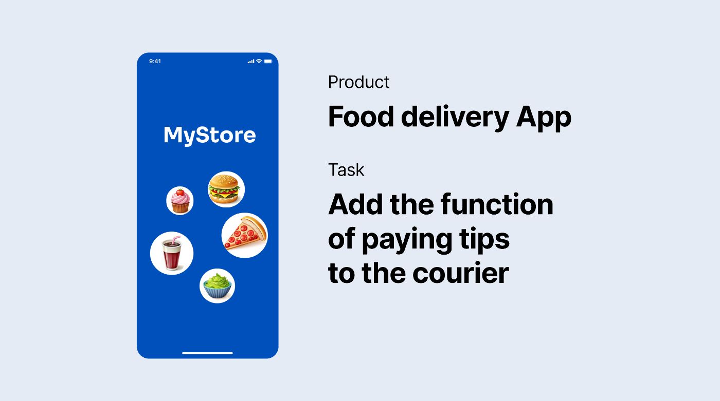
\ Let's say we have a food delivery app and we've been tasked with adding a new feature. Tipping the courier who brought us the order. It should be noted that this is the main type of task for a product designer. Not creating a new app from scratch, but improving and refining an existing one.
\
First, let's try to put ourselves in the role of an interface designer, and use a user-centered approach. Where do we start? Of course, we need to go to our users, study their behavior and desires, understand what they need from this feature and, based on this, offer the best solution that will improve their user experience. And then check how satisfied the users are.
\ Let's say we conducted a survey to find out what percentage of users want to leave tips, and how many people don't like to do it at all. Here, of course, I'm simplifying and the research should be more in-depth, but for this demonstration, this is enough.
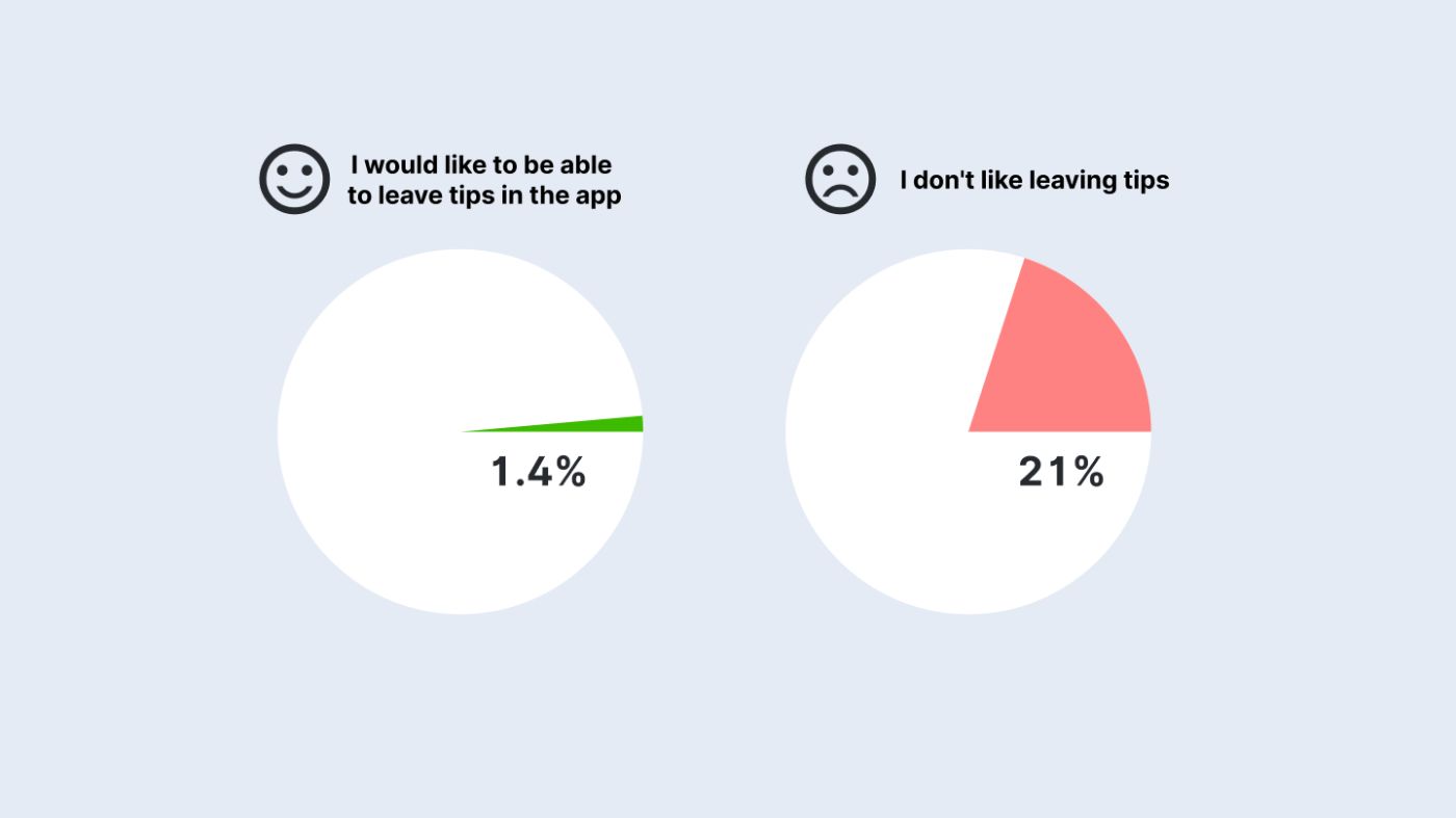
\ So, we got the result: only 1.4 percent of people would like to leave tips in the app, and a fifth do not like to leave tips at all. It turns out that, taking care of our users, we should add a small button somewhere leading to the tip sending dialog, and make it not too bright, so as not to distract and irritate the majority. For example, we decide to put it on the success screen after a successful delivery. Something like this. When you click on it, there will be a transition to the screen where you can select the tip amount and send it to the courier. And so, we have a solution to the problem using a user-centered approach. Everything works great, those who want to leave a tip can do so, for the rest, practically nothing changes.
\
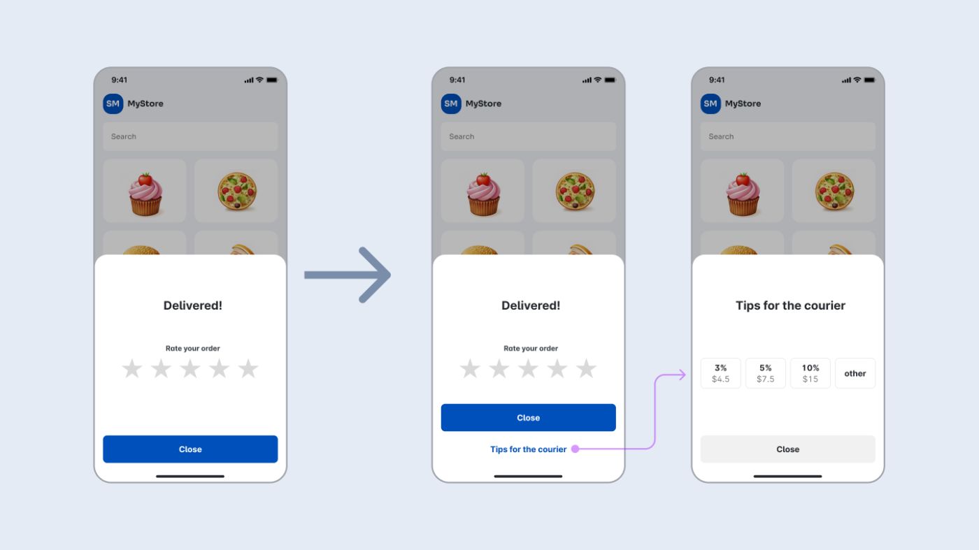
Now let's put ourselves in the role of a product designer. And, as I said earlier, along with studying what users need, we will try to understand what business problems the new function can and should solve. Such problems most often come from the product owner, but the designer can also suggest them themselves, based on their understanding of the overall product strategy. In our example, let's say my team and I decided that these are the three main goals.
\
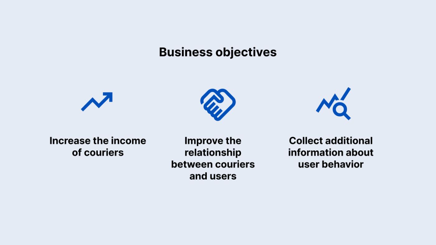
\ First. We need to collect as many tips as possible. This will increase our couriers' income, make them happier, and they will not go to a competitor whose app would not give them so many tips. Moreover, in our delivery service advertisement on the labor exchange, we will tell about how many tips our couriers receive and will lure the best workers to our service.
\ The second goal is to improve the relationship between couriers and users, or at least not to worsen it by asking to leave tips. It will be great if this feature helps customers see couriers as real people, not robots. And couriers feel more grateful for their work.
\ The third goal is to collect additional information about user behavior, understand what they like and why they leave tips in order to further improve our service or additionally reward couriers.
\ As you can see, all these goals are beyond the end-user requests of the application. And now the task of the product designer is to find a fine balance between the interests of users and the business. To design an interface that will solve business goals and will not worsen the user experience.
Step 1. Putting a tip request on the success screenFor simplicity, we will make changes within the same success screen that we modified earlier. Let's take the same scenario, but now think about what we can change here to increase the amount of tips, solve the first business problem. And to do this, we will bring to the screen the functionality that was hidden under the secondary button. Now there is no need to make an extra click and the user immediately sees the offer of specific tip amounts. To increase conversion, we can show the same screen the next time the user opens our application, remind him that he can leave a tip for the previous order.
\
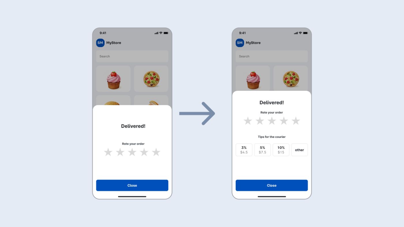
\ Let's say we implemented this function in test mode, conducted a small test and saw that this interface change increased the amount of tips. But, as expected from the results of user surveys, the decision also had negative consequences. In the reviews, many noted that they were a little annoyed by this intrusiveness and they did not like that the application asked to pay extra. Questions arose about what percentage of the tip goes to the courier, and how much the company takes. And in general, the attitude towards our application has worsened somewhat. Thus, we shifted the solution from users to the business task. There were more tips, users became less satisfied.
Step 2. Making the request friendlierNow we move on. Having collected this first feedback, and also keeping other business goals in mind, the team decided to improve the scenario by redesigning the screen as follows:
\
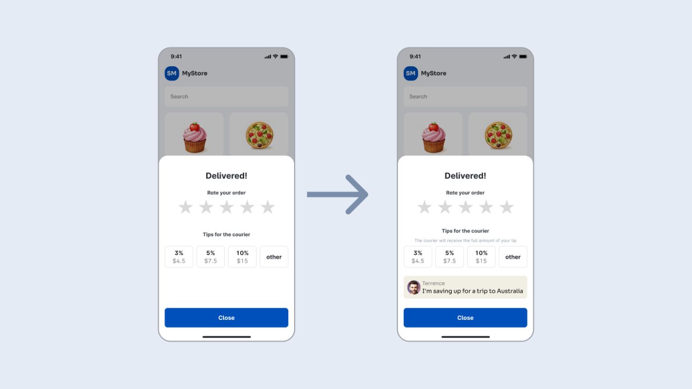
\ As you can see, information was added about who the tips go to - the name and photo of the courier, as well as text stating that he receives the entire tip amount without commission. In addition, the team added a line to the courier's profile “the goal for which I am saving money” to show it in the application. At the same time, the courier's photo was already in the database, so the revision was not too labor-intensive. According to our plan, this should increase trust in our function and further motivate tipping. After all, it is much more understandable to pay 5 dollars to an ordinary guy Terence so that he saves up for a trip than to hand over money to a delivery company. And even if we do not pay a tip, the application will once again remind us that the food was brought to us by a living person who has his own desires.
\ Now we are conducting the following tests and see that this modification of the screen has further increased the total amount of tips and reduced the number of negative reviews in surveys to almost zero. Even despite the fact that this screen appeared before starting to work with the application. In addition, the hypothesis was confirmed that the image and name of the courier on the success screen along with his goal will improve the overall attitude of customers towards them. For example, this was confirmed in regular surveys of couriers about relationships with customers. Thus, this interface is already working to solve two of the three business tasks.
Step 3. Add the survey.Let's move on. By the time the second version test was launched, statistics and additional feedback had accumulated. It turned out that even those who do not leave tips began to spend more time on the success screen, and the support service began to receive more questions - some users did not understand what to click to not pay tips. It was not obvious to them that by default, they do not pay anything by clicking the close button.
\ Taking the next step. In addition to the fact that we need to solve this problem, we decided to make another modification. Ask those who decided to leave tips why they did it. What they liked. In order to additionally encourage couriers and suppliers based on this information, as well as improve the service in those places for which fewer votes are collected.
\
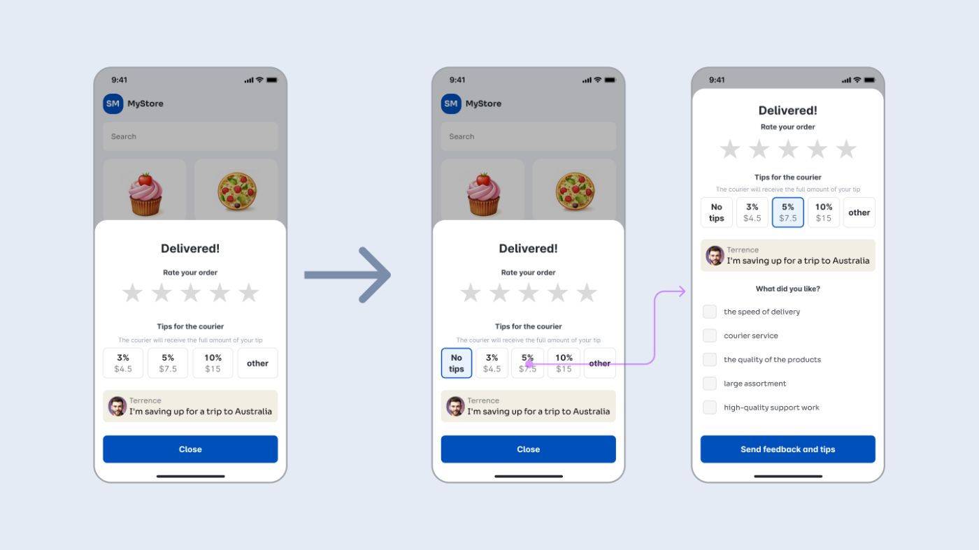
\ In the new version, the “do not leave tips” option was added, selected by default, which solved the problem with misunderstanding. Now it has become obvious that by closing the screen, the user does not pay anything. Also, when choosing any tip amount, a list opens where the user can choose what exactly he liked (or choose nothing). Later, these surveys helped to collect a lot of important information about users, couriers and the service.
\
Step 4. Technical limitations.So, we got a solution to all business goals, and tried to mitigate user inconvenience so that the interface remained user-friendly. However, for example, when transferring it to development, we encountered a limitation. It turned out that if you calculate tips as a percentage of the order each time, this will require too much time from the developers, and the allocation of additional resources, which are currently not available. And we decide to indicate some fixed tip values, calculating them from the average check. The development department says that this can be implemented now, and then we remove percentages from the interface and leave only fixed numbers. As a result, we get a screen like this. From the point of view of user and business goals, everything is also not bad, and the developers will be able to make this function on time.
\
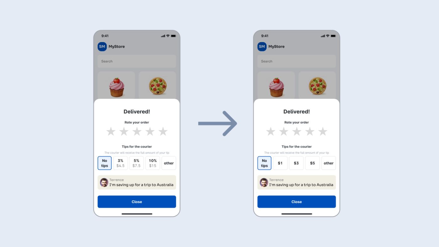
\ So, we got a solution to all business goals, and tried to mitigate user inconvenience so that the interface remained user-friendly. However, for example, when transferring it to development, we encountered a limitation. It turned out that if you calculate tips as a percentage of the order each time, this will require too much time from the developers, and the allocation of additional resources, which are currently not available. And we decide to indicate some fixed tip values, calculating them from the average check. The development department says that this can be implemented now, and then we remove percentages from the interface and leave only fixed numbers. As a result, we get a screen like this. From the point of view of user and business goals, everything is also not bad, and the developers will be able to make this function on time.
\
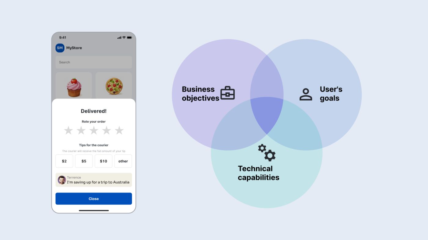
\ And here is the final solution. The tip payment function has been added to the application in such a way as to take into account the interests of the user, implement our business goals, and fit into technical restrictions. Of course, improvements can be continued further. For example, reward users with achievements for leaving tips. For example, write to the client who left the tip that the courier has saved up for the trip and send a photo of Terence against the backdrop of the Sydney Opera House (if he doesn't mind).
\ Perhaps I did not take into account many nuances, and many important design stages were omitted. But I hope I managed to show the most important thing in this example. Namely, how the role of a product designer differs from the role of an interface designer who puts the user at the center. And how a product designer finds the optimal solution to a problem using an iterative approach and collecting feedback.
\ I think it's worth mentioning that this approach doesn't just involve moving from the user to the business. The opposite situation is possible, when we move from achieving only business goals to making the application more convenient for the user. In our example, this might look like a product owner's request to add a bright "leave a tip" banner every 20 seconds. Which might increase the tip size (although I'm not sure), but it will spoil the user experience too much. After which we will suggest abandoning such a banner.
\ In conclusion, I can add that although we solved business problems in this example, ultimately the changes made should improve the user experience. After all, if we achieve them, we will attract more motivated couriers, receive information to improve the service and build a friendlier atmosphere. And ultimately, we will make the product better for everyone.
\
Thank you for your attention.- Home
- About Us
- Write For Us / Submit Content
- Advertising And Affiliates
- Feeds And Syndication
- Contact Us
- Login
- Privacy
All Rights Reserved. Copyright , Central Coast Communications, Inc.