and the distribution of digital products.
Cross-Platform Design Wrapped Part 2: Creating App Architecture
\ The world of UI/UX design is a world of limitless possibilities. This is exactly why writing these articles feels like a refreshing introduction to the basics, which become the working ground for future developments. Building a foundation is exactly what I’d like to discuss today. In the first article, we talked about users' needs and expectations across different devices – this one is about how we build the structure that supports those experiences.
\ In UI/UX, there is a backbone that holds everything together and shapes how an app works and feels across different devices. That backbone is ==app architecture.== It is that very structure that makes apps feel great in use. It’s not just about the technical framework; it’s also about seamless adaptability, whether it’s a quick phone check or diving into productivity mode on their laptop.
Plus, this is one of the most critical parts of product design. Unlike UI, app architecture is not something you can easily tweak once implemented. It affects almost every stage of development, from the tech stack to content structure, user experiences, and the design system.
\
Unlike UI, app architecture is not something you can easily tweak once implemented. It affects almost every stage of development, from the tech stack to content structure, user experiences, and the design system.
\
App architecture in cross-platform designIn UI and UX, we refer to app architecture as the organizational structure of an app's interface, interaction patterns, and navigation flow. It defines how content and functionality are arranged, how users move through different screens, and how information is presented and accessed.
\ The architecture is unified across platforms — the same content, functions, and user flow — but adapts to fit the capabilities and constraints of each device. For example, a personal finance app might feature tasks like viewing balances, tracking expenses, and managing budgets across multiple platforms. And how certain elements are prioritized or arranged may differ:
\
On mobile, the architecture usually prioritizes quick access to essential features with a simplified, linear flow.
On tablets, the larger screen allows for more multitasking, with more information displayed simultaneously.
On desktop, complex interactions like multi-pane layouts or detailed data visualizations take advantage of the larger screen real estate.
\n For a product designer, the final goal is to make the architecture both ==consistent== and ==flexible== enough to work across multiple devices. It requires a strategic approach that balances UI, UX, information architecture, and the underlying technology. Plus, I need to have an understanding of how all these factors influence each other.
\ As I mentioned in the first part of this series, we are not creating app architecture in a vacuum. It is made in close alignment with available resources in terms of development, strategic plans for the app, and the current product stage, as well as IA and UX. The UI and design system are only layered on top of the architecture, giving it life!
\
\
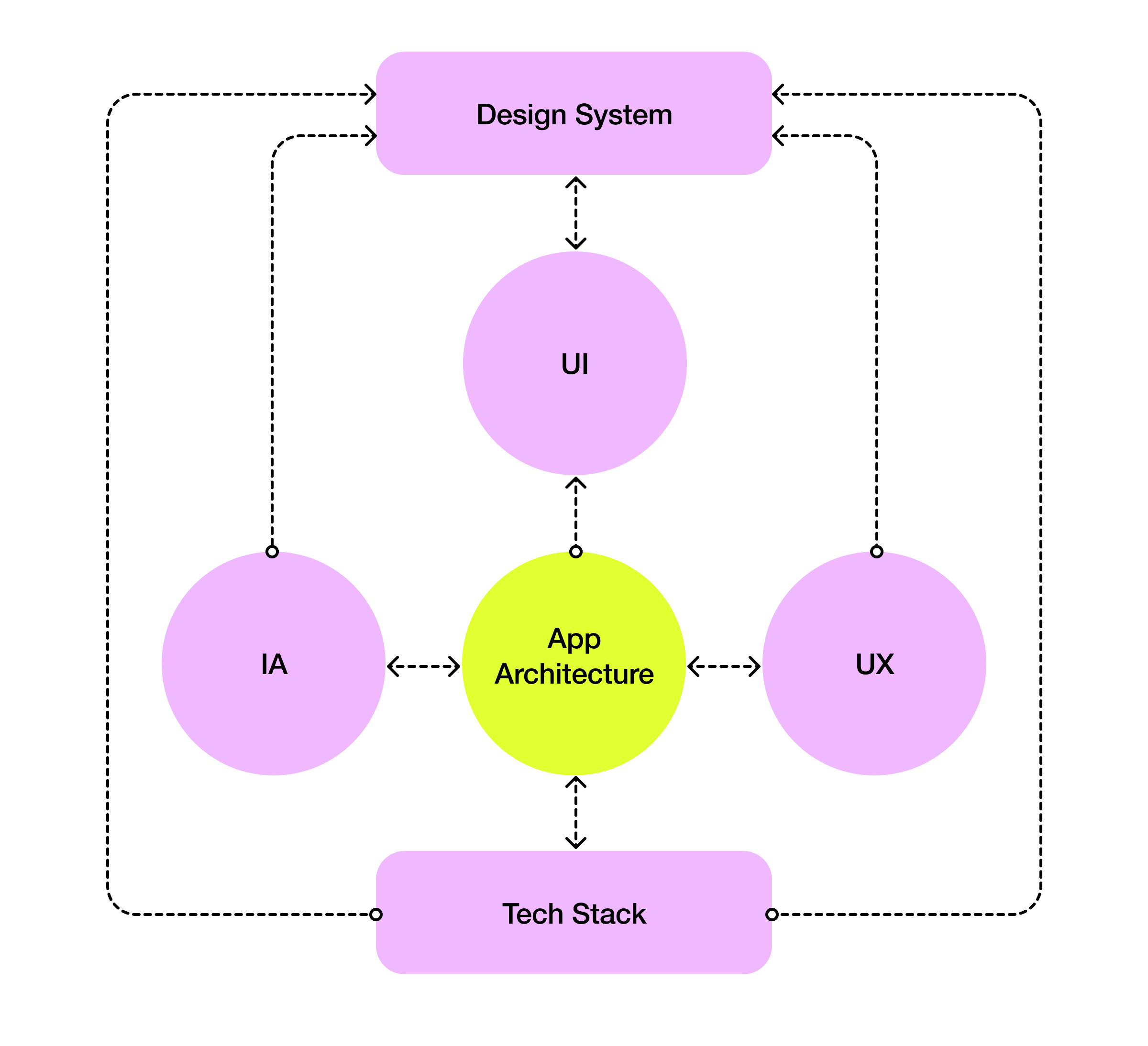
This article continues our journey into cross-platform design: we’ll explore the key strategies that help ensure your app feels both consistent and adaptable across platforms, this time through architecture. It’s time to build a solid foundation. \n
Tech Behind the DesignApp architecture and the tech stack work hand in hand. The architecture is the blueprint, and the tech stack is the building material. As a product designer, you have to understand the tech that supports your creations because the choices you make regarding tech lay the foundation for everything that follows.
\ One of the key decisions you will make is how to approach code sharing, which can impact the flexibility, performance, and overall user experience of the app.
\
:::tip For example, if you go web-based (e.g., React Native, Electron), the architecture needs to be flexible enough to handle the varied environments, making sure the app feels consistent on all devices. Or, if you opt for a native framework (e.g., Catalyst), the architecture has to be robust enough to support multiple codebases, each tailored to its specific platform.
Whatever you choose – the tech stack sets the stage for what the app can do.
:::
\
Key Approaches to Developing a Cross-Platform AppThese two approaches I just mentioned are the main ones to consider. Web-based frameworks and Native solutions have their strengths and weaknesses, which should (and probably will) influence your design decisions.
\ Web-Based Frameworks (e.g., Electron)
Web-based frameworks like Electron let you write code once and run it smoothly across multiple platforms with minimal changes. This is a game-changer for efficiency, as it enables faster development and makes maintenance a breeze. It can also be integrated with React, so you can deploy your app on iOS, Android, and web browsers, all while maintaining a consistent interface and user experience.
\
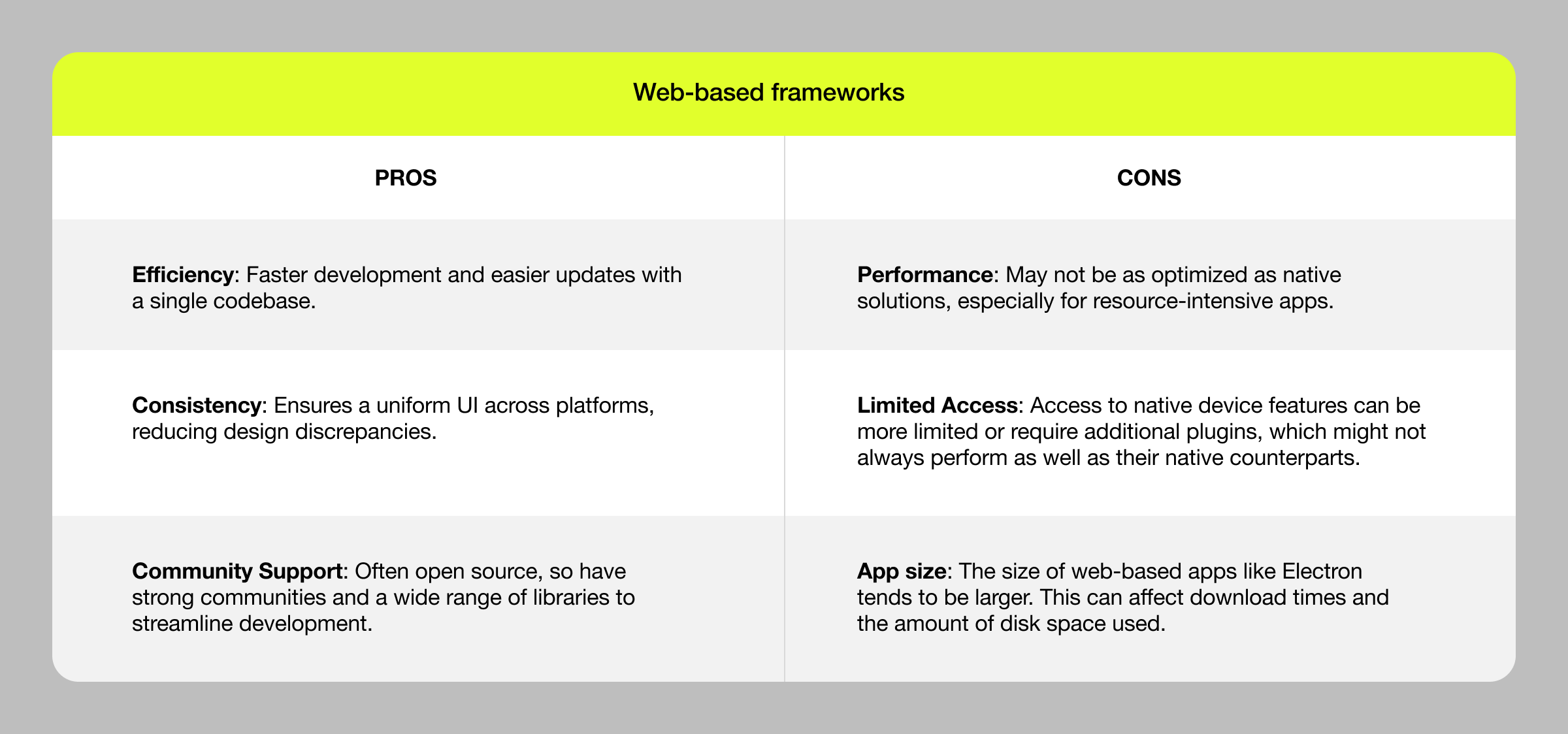 \n
\n
Examples:
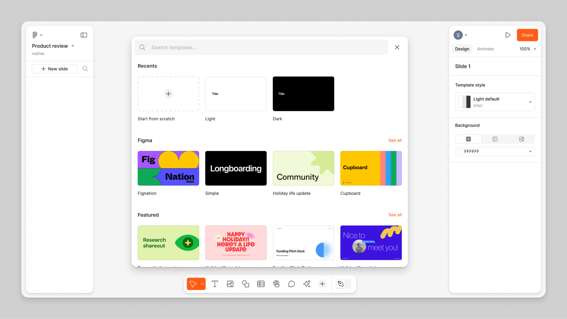
Hundreds of apps are built with Electron. Products like Slack and Discord have successfully used Electron to create consistent experiences across iOS, Android, Web, Windows, MacOS, and even Linux while benefiting from the efficiency of code reuse. Even Figma, the beloved app of all designers chose Electron as a cross-platform solution.
\
\ Native Solutions (e.g., Catalyst for Mac, UWP for Windows)
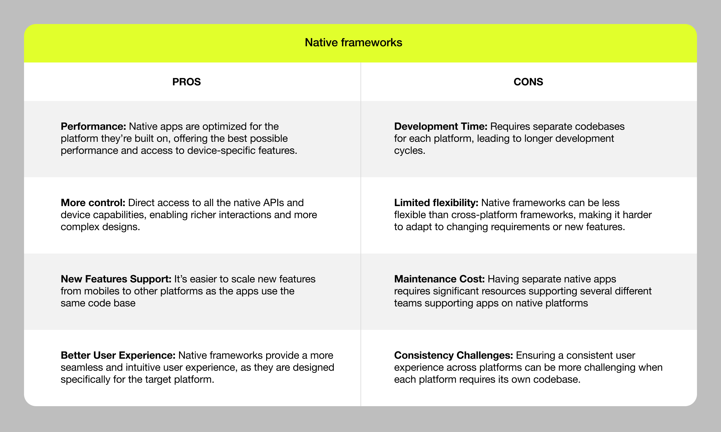
This approach involves building separate codebases for each platform, tailored to fit the specific operating system. Catalyst allows developers to port iOS apps to macOS, and UWP lets apps run across all Windows devices with a single codebase. While native frameworks like Catalyst and UWP come with great benefits, they also require developers to learn platform-specific skills and tools. This can be a big investment, especially for teams with limited resources or experience. But, for projects that prioritize performance, security, and a seamless user experience, native frameworks can be a needed choice.
\
\ \ Examples:
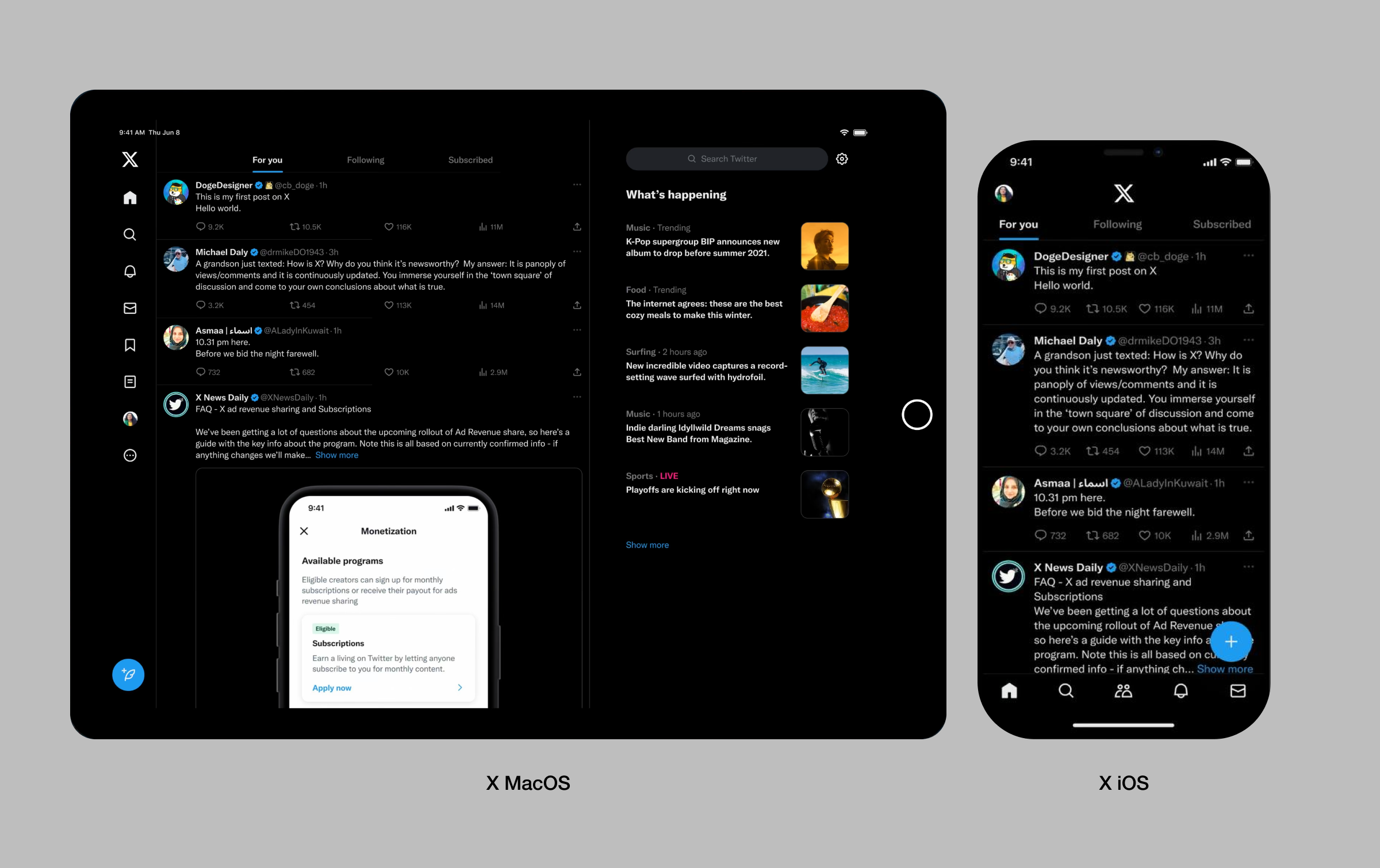
- X (formerly Twitter) uses Catalyst to deliver a native macOS experience while maintaining consistency with its iOS app. The said ‘experience’ includes features like Dark Mode, Touch ID, and Continuity Camera – basically, all native capabilities of macOS while maintaining consistency with iOS too.
\
\
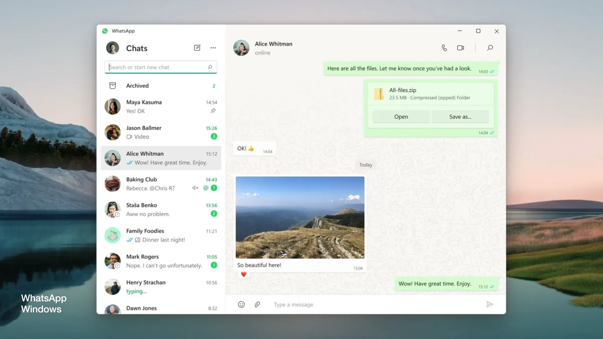
- The WhatsApp UWP integration for Windows brings the popular messaging app to the Windows platform using the Universal Windows Platform (UWP) framework. This native integration makes for a seamless and consistent user experience, with improved performance, enhanced security, and exclusive features like support for Windows Ink and Cortana integration. Users can sync their messages, contacts, and media across all devices and enjoy better multitasking and accessibility features.
\
\
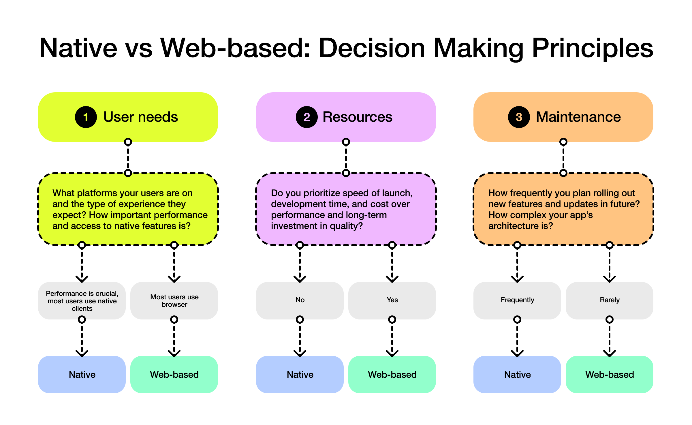
Principles for Choosing the Right ApproachMaking the right choice will be influenced by several factors, and the three main ones are User Needs, Development Resources, and Long-Term Maintenance.
- User Needs: What platforms your users are on and the type of experience they expect. If performance and access to native features are critical, then a native approach is best.
- Development Resources: Helpful for a quick launch across multiple platforms with limited development resources.
- Long-Term Maintenance: Web-based frameworks for easier updates across platforms, native solutions for complex, and feature-rich apps.
\
\ Understanding these approaches is just the tip of the iceberg. As you dive deeper, having a good grasp of the things affecting your architecture choice will automatically elevate the result you produce!
\
Designing app architectureThe design process is a team effort that brings together different perspectives and expertise. Any project starts with conversations — not just among designers but with developers, product managers, data scientists, and even content strategists.
\
:::tip You might find yourself sitting down with a developer to really understand the technical limitations of a certain feature you’ve envisioned. You’ve designed a beautiful, intricate navigation system that looks great on paper, but now the developer suddenly points out that it could slow down the app on older devices. This is where collaboration becomes crucial. Together, you can work out a solution that maintains the integrity of the design while fitting within the technical constraints.
On your other side you’ve got a product manager who is being quite persistent about a business requirement that needs to be taken into account. Maybe, the app needs to support a new feature that wasn't part of the original plan. For example, the new feature adds another tab to your navigation bar and your design isn’t scalable. This means you’ll need to revisit your design to make sure the architecture can accommodate this without overwhelming the user (or the team).
:::
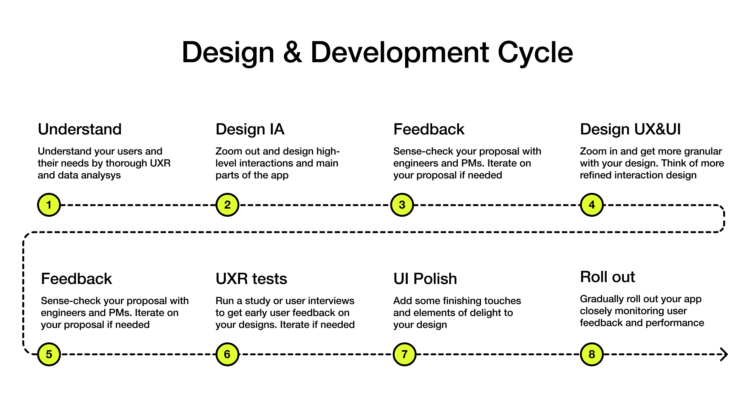
\ As a designer, a lot of your architecture choices will be based on understanding how the user will interact with the app across different devices, and your main focus should be on ==User Experience== and ==Information Architecture.==
\
\
- Start with UX and IA: Begin by mapping out the user journey and organizing content in a way that makes sense for the user. You’ll need a good grasp of user needs, behaviors, and the context in which the app will be used. The goal is an intuitive flow.
- UI Comes Second: Once the UX and IA are in place, the next step is to layer on the User Interface. You translate the structure into visual elements, keeping the design both functional and visually consistent. The UI should complement the UX, not overshadow it.
- Iterate. At every stage, be brave and ask for feedback from your team, especially engineers and users if you can get hold of them. They know things you don’t: listen, improve. Designers often view their designs as precious and unchangeable. Don't fall into that trap! The more flexible your designs are, the better the final product will be.
\
A note on native design principlesWhen designing for native platforms, pay special attention to native design systems and principles. Apple Human Interface Guidelines (HIG) for Apple products and Fluent Design System (FDS) for Microsoft platforms will give you valuable insights into what users expect to see on each platform. This will save you time and keep your designs consistent with the platform's design language. By following the HIG and FDS, you can create an app that reflects your brand's identity and values with a consistent look and feel across all platforms.
\n 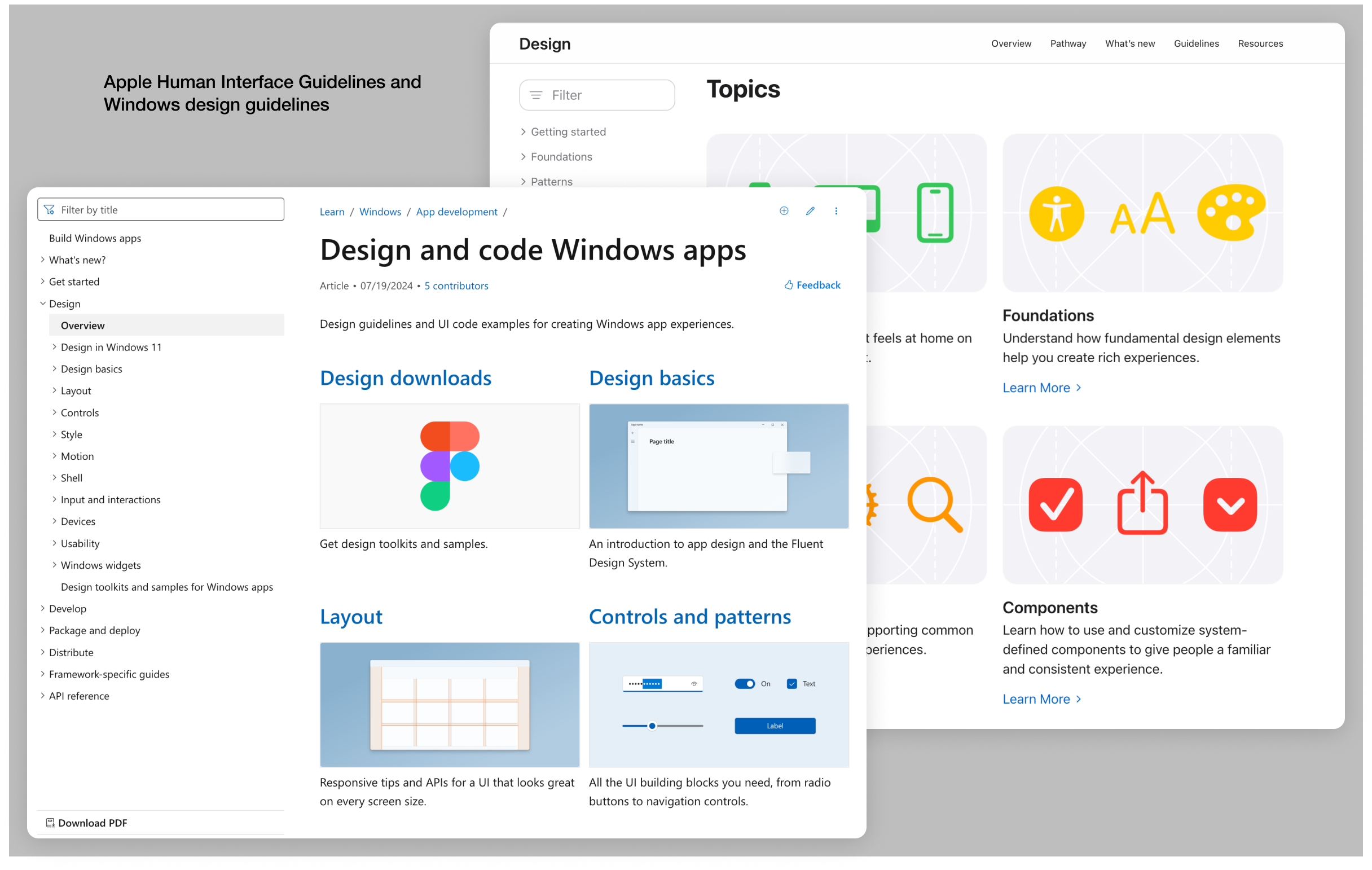
By this point, you should be able to see what lies at the heart of cross-platform design. App architecture ensures your app delivers a seamless, ==consistent== experience across devices while staying ==flexible== enough to meet the unique demands of each platform.
Architecture defines how content is structured and navigated, setting the stage for smooth task flows and interactions. The tech stack is what shapes the architecture. ==Cross-platform== solutions offer efficiency with a single codebase, while ==native solutions== provide deeper integration and better performance, though with higher complexity and cost.
\ Once that foundation is in place, the UI adds visual coherence, making the app feel natural across mobile, tablet, and desktop. For a UX/UI designer, you need to think strategically about how architecture ties into I==nformation Architecture, User Experience,== and ==User Interface.==
\ And, of course – app architecture is closely tied to technology, development resources, and strategic goals. Finding balance will allow you to create a comprehensive design system and user experience that are intuitive and adaptable to any device. Intuitive flow and seamless cross-platform integration. Isn’t that the dream?
\
- Home
- About Us
- Write For Us / Submit Content
- Advertising And Affiliates
- Feeds And Syndication
- Contact Us
- Login
- Privacy
All Rights Reserved. Copyright , Central Coast Communications, Inc.